Australian Seismometers in Schools - Noise monitoring dashboard
Meghan S. Miller, Australian National University and Louis Moresi, Australian National University
How we built a simple dashboard using Github actions with open source software and openly available (FAIR) data.
(Originally published at www.underworldcode.org - we have updated this article to reflect a whole year of the dashboard and the different lockdowns across the country)
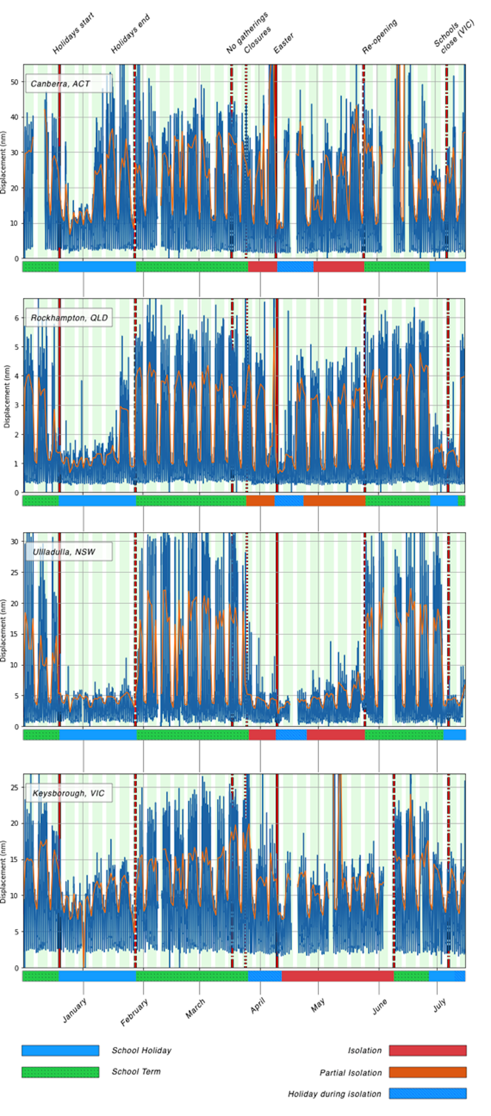
We wrote an article in The Conversation that shows how the Australian Seismometers in schools network registers the pulse of Australian life through changes in the seismic noise spectrum measured in local schools.
The figures in that article show the signal from Christmas 2019 through to July 2020 and, like any publication of record, they are static. But the data continue to flow into the school seismometers, so every night we update those graphs automatically and you can see the version from last night here. The codes have been running every night for the past 18 months, through local lockdowns, school holidays and normal school. The patterns of activity over the "normal" school year stand out clearly and are quite different depending on whether the school is in a busy area or if the noise signals are all generated by the presence of students.
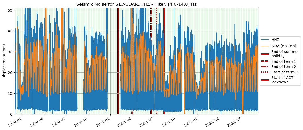
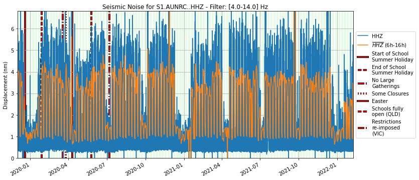
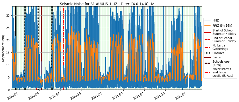
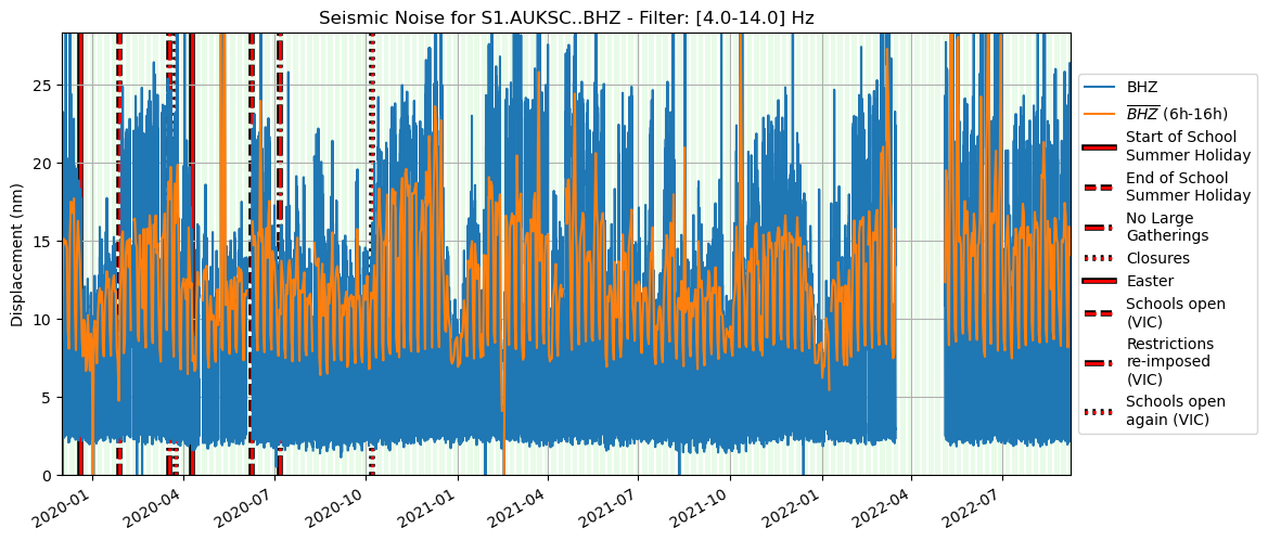

These images are raw versions of the plots used to make this figure from The Conversation article and the links point to the Github repositories that generate the images each day.Because we link to the image and not a copy of the image, it will always be the latest version.
Day-by-day Activity


What we see in these plots are typical levels of activity hour-by-hour, for each day of the week, and broken down by pre-COVID, lockdown, holidays, and during a re-opening period. The Ulladulla high school is very quiet outside school hours, Keysborough is in a more noisy area but before the COVID outbreak, Saturday school sports still stand out.
How it works
We built a template repository on GitHub where we keep a copy of the python notebooks and scripts that generate the plots we need. The next thing we did was to add some Github actions to the repository which are small scripts that run if the code changes or, otherwise, every evening. These fetch new data, build the latest figures and send a warning email if anything goes wrong. Then the same scripts upload the day's processed signals (to save time the next day) and update the images in the original repository.
For any station that we want to monitor, we make a copy of the template repository and change a few settings that describe how to find the data on the Auspass servers. Then we just need to wait for the scripts to grab all the data and build the images. It takes a while the first time but just takes a few seconds next time around.
There is a "health check" image that shows gaps in the data that is handy when warning messages roll in. This is the health check for the Ulladulla station which has a few gaps here and there but is healthy enough to produce a clear noise plot.
What else ?
It is quite common to see code repositories with badges that show if the current code is working well. Sometimes, though, it is also useful to tabulate or graph the results of benchmarks over time or speed tests that are not automated. Actions running periodically can do this very easily and also keep the results synchronized and versioned alongside the code itself.
Can I use this ?
Of course — all of these codes are open source including everything we built in the template to make the dashboards.